Bosque Haus is an advertising agency located in Stephenville, Texas. They wanted a logo that pays homage to the iconic Bauhaus school while also incorporating elements of local landmarks, like the Bosque River.
Logos In Action
Designed for Versatility
About the Logo Set
To ensure flexibility and consistency across different applications, I developed multiple versions of the Bosque Haus logo. Below are a few variations from the logo set, tailored for various sizes, space orientations, and color formats.
Symbolism
The Meaning Behind the Mark
Design Brief
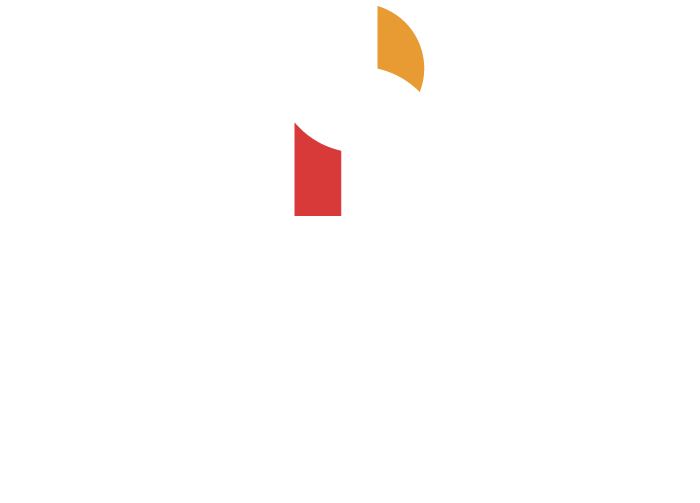
Per the client’s request, I incorporated geometric shapes and subtractive primary colors to create a distinctly Bauhaus-inspired look, while also integrating symbolism that represents the Bosque River. Below, I’ve outlined the key symbols embedded within the design.
Software
Bosque River
The Bosque River, which flows through Stephenville, is abstractly represented in the logo’s design.
Letter B
The silhouette of the logo forms a bold, geometric letter “B,” reinforcing the brand’s identity.
Letter H
By connecting the implied lines in the logo, a subtle letter “H” is formed, further highlighting the name “Bosque Haus.”
Grid System
Crafted for Positive and Negative
Visual Congruency
Due to the irradiation illusion, where light lines and shapes appear larger than their dark counterparts, two versions of the logo were necessary.
To ensure visual consistency between the light and dark versions, slight adjustments were made to both. This is reflected in the grid systems used to create each version of the logo.
Typography
Dependable Typefaces with a Bauhaus Twist
Typeface Selections
The Primary Typeface is a modified version of Dense. This type was chosen for its condensed, geometric characters, which add an elegant twist to the classic Bauhaus style.
The Secondary typeface, Montserrat, was similarly selected for its geometric forms. It also establishes contrast with the more condensed Primary Typeface.
Customizations
To give Dense a more Bauhaus-inspired feel, I modified several glyphs by lowering the bars, crossbars, and chins, as well as rounding the apex of the uppercase “A.” The result is a custom typeface, which I’ve named Bosque Dense.